


Farms
Google Maps wants to be a mirror selfie with no phone in it

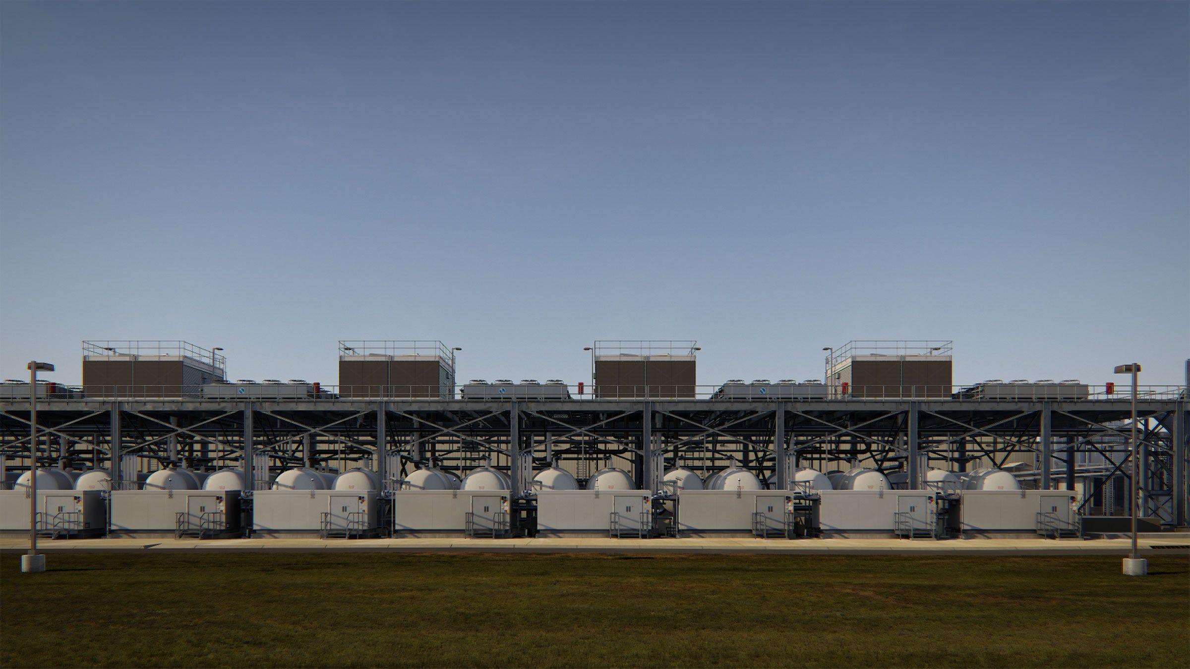
Image from Farm (Pryor Creek, Oklahoma), 2015
In 2015, John Gerrard asked permission from Google to make a portrait of the conglomerate’s industrial data centre in Oklahoma. When they refused, he sent a drone over anyway, which captured 2,500 photographs of the whole area. These photographs were turned into a video, which was created using 3D modelling and an incredibly precise game engine. The two films named Farm (he later did one of another data centre in Iowa) show a virtual, rendered replication of these industrial complexes, complete with a day to night cycle, and pan ominously over every inch of these anonymously boring buildings. They are all grey railings, towering floodlights and and industrially vertiginous architecture.
The joke, of course, is that Google, who now own satellite imagery for 98% of the world’s surface, has an expectation of privacy over its own property. When you navigate to the Iowa data center in Street View, you can click around the outside of the server farm, even watching the American flag that stands outside the entrance waving from the left to the right of the flagpole. If you click the arrows fast enough, you can watch the wind (captured June 2019, according to the tagline at the bottom) shimmer through the cloth, as if you were flicking the pages of a flip book. But the roads, buildings and machinery that stand the inside are as opaque as the algorithms that Google uses to determine its search rankings. In Oklahoma, it’s even worse: a huge red-toned polygon settles over the map, a calm, AI-blank “fuck you” to the information seeker.
I started thinking about all of this after reading this story about Google’s revamp of its map visualisation: terrain will now have a greater differentiation on tone, to reflect the glut of satellite imagery that the company is sitting on. Forests will now be a differentiated shade of green from, say grassy meadows. And a mountain that has snow at the top of it will have an icing sugar sprinkling on the map. More importantly (to me, at least - is there really a useful human purpose of reflecting the colour of geographical areas from above?), pavement widths, traffic islands and pedestrian crossings will be marked in cities - likely to people everyone, but especially those with disabilities, navigate cities.
Maps, when we want them to work, need to be realistic. They should have contours that fall and rise as we walk them. A map, to be useful, should mimic our experience as much as possible. That’s their entire point - realisticism, to quote the title at the top of this page.
Last week, I went biking around Cape Cod, a place that is occasionally very well designed for cyclists, but only if you can drive a car to get to those occasional spots. A lot of the time we found ourselves peering down at maps, hoping that the yellow splodge of beach we were cycling towards wasn’t privately owned (it usually was) and had some shade on it (it never did). Irritatingly, the many private beaches were almost uniformly empty, and often had umbrellas stuck in the sand, shade-providing prongs trussed into inutility. The yellow on the maps would promise and tantalise us, naive Europeans expecting public access where our pedal-churning legs led us to water. The mirror was frustratingly useless - not designed for us two-wheelers, who didn’t bring umbrellas and owned precisely zero shoreside houses.
Google Maps, a project which is seemingly obsessed with the idea of a complete and total digital mirroring, uses a series of satellite images to alerts its users where is desert, snow field, mountain and meadow. But the attempt at mimicry is a commercial sham. Its own physical existence, a spot in a big sea of Oklahoma grey, is conveniently scrubbed - like a phone nonsensically Photoshopped out of a mirror selfie. Google Maps aspires to be a simulation, the map on a scale of a mile to a mile that can let us see places we never have been or will go. Its own stubborn absence is proof that of the simulation’s fakery, even if we now know where to cross the road.
I’m into:
Did you know that there are people doing magic in prison? The craft and ingenuity that goes into making these props is so impressive (and, it should be said, wouldn’t be necessary if incarcerated people were treated with more humanity). Aside from that, I’ve been enjoying the blessed relief of falling into late ‘90s TV - bingeing on Farscape, which is the perfect “monster of the week” sci-fi nonsense.
I’ve written:
Here’s my profile of the artist Sidsel Meineche Hansen, who was recently awarded one of the Turner bursaries for 2020, and makes work about the invisible digital labour in the sex industry, and many other deeply interesting things! I hope you like it.
Until next time,
Josie